 I love it when customers recommend me to their relations. Mark was one of those associates who contacted me after hearing about my work from his colleague.
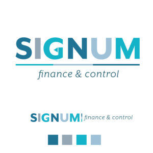
For his new company, he needed a logo and website. After our first Zoom conversation, because I always want to know everything about the person and the company, I first started designing the logo. Mark had a preference for the colors blue and gray, typical financial colors. But when you look at the colors in the financial world, it can quickly come across as boring and that's exactly what I wanted to avoid. So I chose a different shades of blue and gray.
Mark told me during the Zoom conversation that Signum stands for 'Mark' in English, not only his name but also an indicator. That's why I added a little detail to the logo in the form of a triangular pointer.
I chose for the pay-off underneath the logo a traditional classic finance font to make the connection with the finance world.
Because the logo will be used in several designs, I made a second version for use on the website and other elongated places such as banners and billboards (if needed in the future).
After the logo and branding were completed, I continued with the website for SignumFC.
Do you have questions about logo design? Are you also looking for a new logo for your company? Or do you just want to know more about general design work? Click on my Calendly to book your free consult or contact me by email so I can answer all your questions.